
5 Color Concepts Do's & 4 Misleading Color Practice Don'ts
Color is more than an aesthetic choice in data visualization. Color plays a huge role in effectively conveying your data story. Proper use of color will enable end users to understand the visualization quicker, allowing them to reach faster and more accurate conclusions. On the other hand, proper use of color may make sure your end user understands the message.
Here we’ll share five color concepts, when to use them, and four misleading practices to avoid.
Color Concepts
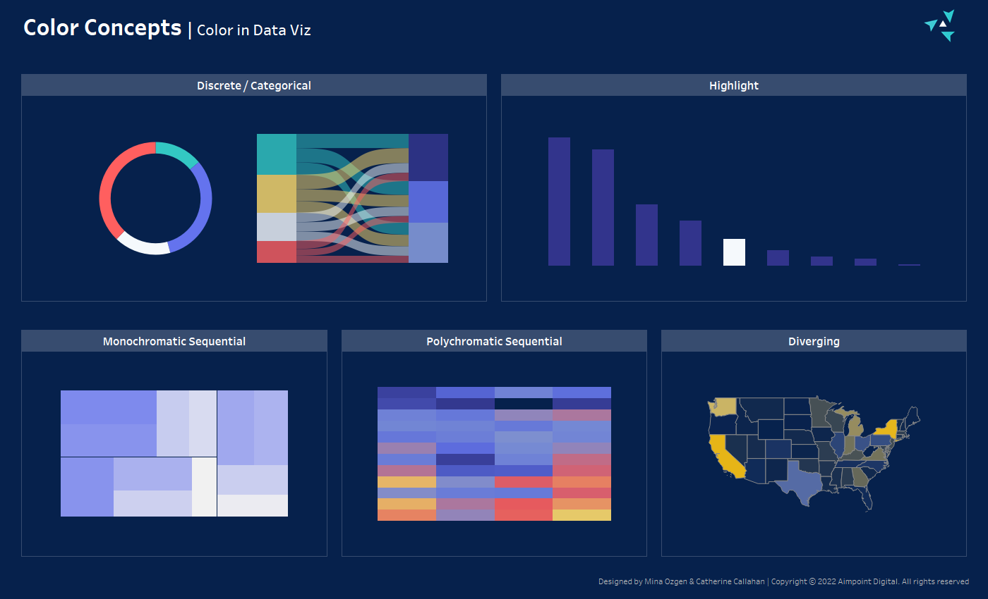
Categorical
- Trait: Distinguishes categorical entities from each other
- Purpose: Best utilized when comparing the same entities across multiple charts and metrics
- Example: Comparing the US, Canada, and the UK across a variety of KPIs
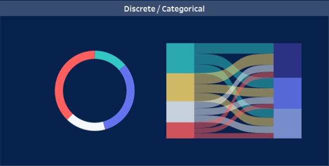
Highlight
- Trait: Most data points are denoted in a muted neutral color, whilst certain data points are denoted with a high-contrast color
- Purpose: Draws the users’ attention to the data points of most interest
- Example: Highlight service-level compliance failures
Monochromatic Sequential
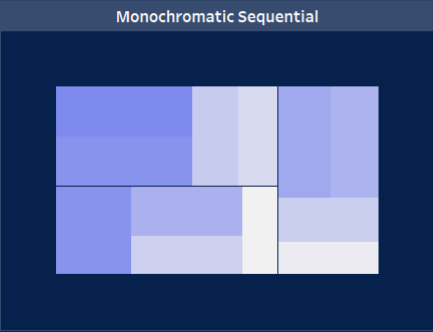
- Trait: Gradient of a single color
- Purpose: Indicate where a numeric value lies within a range
- Example: Company revenue
Polychromatic Sequential
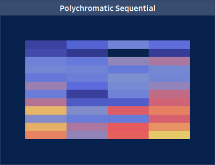
- Trait: Gradient using multiple colors
- Purpose: Indicate where a numeric value lies within a range, but easier to make more precise comparisons in the mid-range
- Example: Highlight ebbs and flows of website traffic across hours & days
Diverging
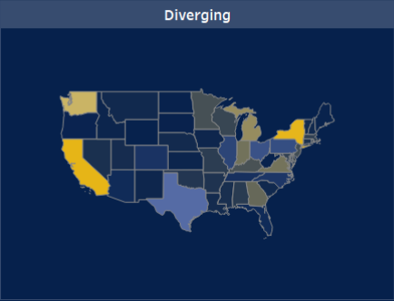
- Trait: A Gradient which has two color intensities on each end of the range and in the center breaks from one color to the other
- Purpose: Give an indication of a classification while also indicating a value within a range
- Example: Products by profitability
Misleading Color Practices
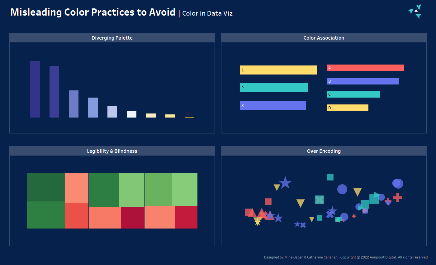
Diverging Palette
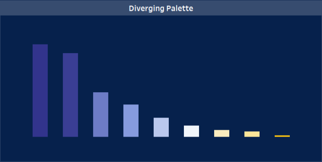
- Using a diverging palette where the break is arbitrary and infers some significance where none applies.
Color Association
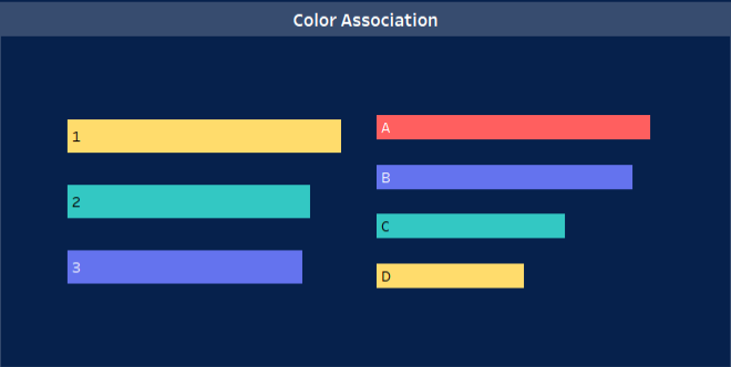
- Reusing colors on the same dashboard/chart to mean different things can be misleading and difficult to interpret. Using the same shade of blue to represent New York on one chart and West Cost on another will cause confusion.
- Inverting natural color associates can cause confusion (such as making sea brown and land blue instead of sea blue and land brown).
Legibility & Color Blindness
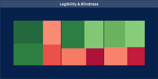
- In order to discern different values, there must be enough contrast between colors; if there are four very similar shades of purple, an end user has little chance of discerning (let alone quickly) what each item is.
- Aside from standard color contrast, common color blindness (such as red-green) should be considered. Try using free online programs (like this one) to test the legibility of your color palette & find inspiration for accessible ones.
- If avoiding color blind unfriendly palettes is not possible, the next best alternative is to “double-encode,” i.e. to encode by color but to also encode by something else (such as arrow icons).
Over Encoding
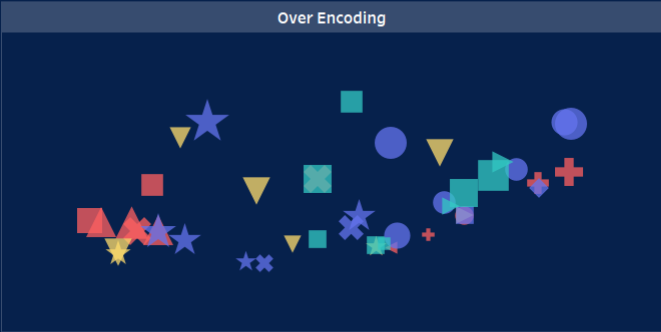
- Too many discrete categories for an end user to retain or discern (as the greater the number of colors, the more likely there will be colors used that are similar)
- Using too many colors in one chart can also lead to confusion. Assigning colors to fields with more than eight unique values is not recommended. Those may be more effectively visualized in another manner, such as a bar chart or heat map.
Tip: follow Aimpoint Digital on Tableau Public & Favorite this viz for reference, and if you would like additional assistance, please reach out to us through the form below:
Author


